Friday Photo Tip #4 Color 101
Today's photo tip is to help you look deeper into the photo that you're taking. There are many different considerations you may take before clicking the button - color should definitely be one of them! Looking for like and complimentary colors in an image will help inhance the overall power of the final photo.
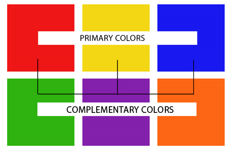 You probably remember from grade school learning about primary and complementary colors. I've made a chart to illustrate the primary colors (red, yellow and blue) as well as their complementary counterparts (green, purple, orange).
Since human vision is trichromatic (meaning that we have 3 channels for conveying color information), our primary colors consist of red, yellow and blue - and other colors are a result of a combination of the three.
For example - green is red's comlementary color because when you mix yellow and blue (the 2 remaining primary colors), green is the result. This is the same for red + blue = purple and red + yellow = orange.
Basically, when you place a primary color next to a complementary color, they make each other look brighter - and in most cases the result is more visually appealing. Of course other factors such as tone and temperature also play a part in creating aesthetically pleasing color combinations.
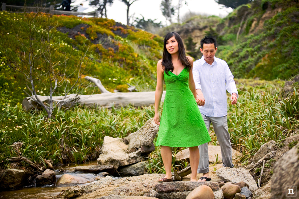
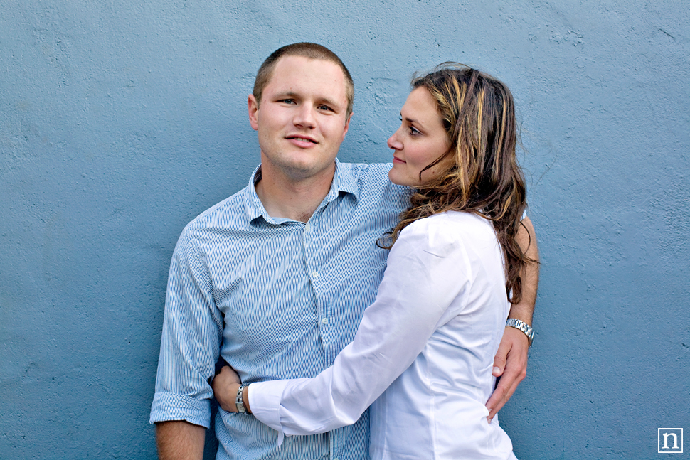
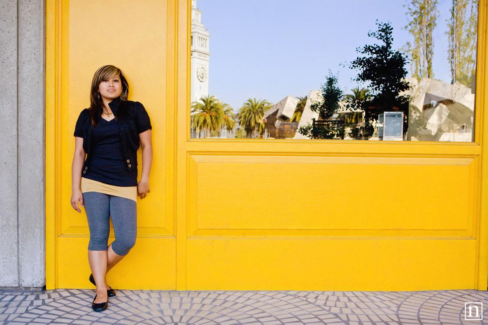
Using color as the basis for composing a photo definitely brings life to an image. Look at the colors around you - on the people you're shooting - on the buildings and objects you see. Looking for similarities in color throughout the photo and in the details will help create a cohesiveness to the image. Look at the photos below as an example.

Color 101
 You probably remember from grade school learning about primary and complementary colors. I've made a chart to illustrate the primary colors (red, yellow and blue) as well as their complementary counterparts (green, purple, orange).
Since human vision is trichromatic (meaning that we have 3 channels for conveying color information), our primary colors consist of red, yellow and blue - and other colors are a result of a combination of the three.
For example - green is red's comlementary color because when you mix yellow and blue (the 2 remaining primary colors), green is the result. This is the same for red + blue = purple and red + yellow = orange.
Basically, when you place a primary color next to a complementary color, they make each other look brighter - and in most cases the result is more visually appealing. Of course other factors such as tone and temperature also play a part in creating aesthetically pleasing color combinations.
Using color as the basis for composing a photo definitely brings life to an image. Look at the colors around you - on the people you're shooting - on the buildings and objects you see. Looking for similarities in color throughout the photo and in the details will help create a cohesiveness to the image. Look at the photos below as an example.


Recent Posts
Comments


Hi,
Wow I have always wondered why some photographers’ photos just look ‘right’ and I could not figure out why but now that I think back it hits me like a ton of bricks… complimentary tones.
Thanks, your post will no doubt improve my photography!
Regards
Heinz